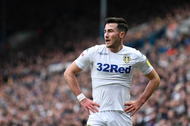
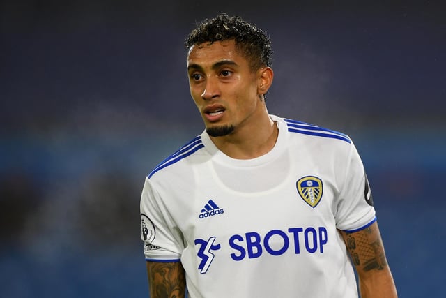
This time, United's home kit features white, navy and yellow as adidas drop the button-up collar that characterised last season's release in favour of a crew neck.
While SBOTOP remains the main shirt sponsor, Wish have taken over the sleeve after sponsoring Marcelo Bielsa's bucket for the 2019/2020 season.
For kit designers, updating a white shirt must feel like reinventing the wheel, and manufacturers have made a few special efforts to keep things fresh down the years.
Here's every Leeds home shirt from the last ten years ranked from worst to best...
1. 2016 - 2017
Somewhere amid the branding there's a Leeds United badge. The blue stripe on the shorts livens up what is otherwise a pretty uneventful get-up, but it feels more like a Kappa kit than a Whites home strip. Photo: Laurence Griffiths
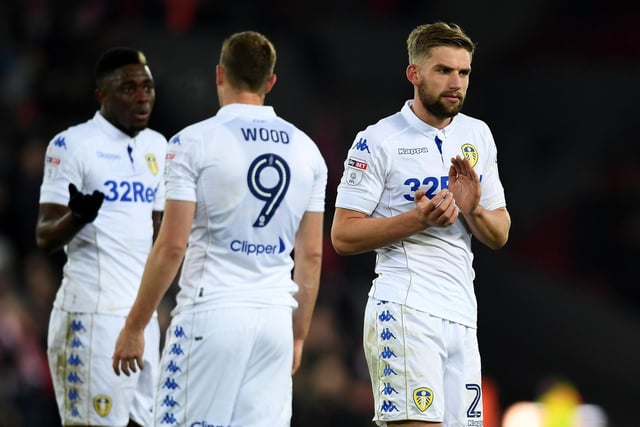
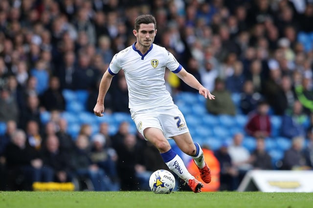
2. 2018 - 2019
If you can dissociate this shirt from the giddy excitement of the Bielsa dawn, you'll see this is a very bog-standard kit. The gambling ad is its most striking feature and it's hard to see what thought goes into it beyond, 'white? tick'. Photo: George Wood
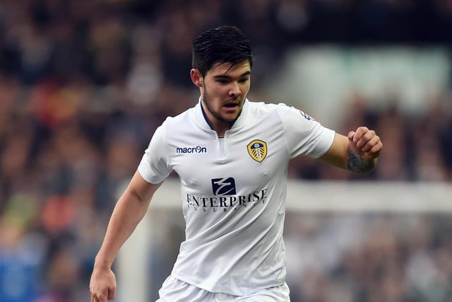
3. 2014-2015
Neither here nor there. It's white, so the traditionalists are pleased, but it doesn't try too hard - which is perhaps the reaction some fans wanted after the two previous seasons brought a huge blue chunk down the middle and bright yellow sidelights respectively. Photo: Clint Hughes
4. 2021 - 2022
Again, it's difficult to separate this kit from the memories it inspires - heavy defeats and players down on the ground receiving treatment. Not a significant departure from the previous season's offering - thought the button-up collar is a nice feature - and the shade of yellow doesn't quite feel Leeds. Photo: Stu Forster
5. 2015 - 2016
The absence of a shirt sponsor makes this strip look a little bit like something your PE teacher just pulled out of his kit bag. It's generic, but kind of classic - the chunky blue borders on the shirt and socks make white look interesting, and the blankness of the shirt draws the eye to the LUFC script on the shins. Photo: Daniel Smith
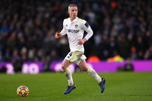
6. 2020 - 2021
New league, new season, new sponsor, new kit provider. adidas' blue-centric Leeds debut is well-received but doesn't make waves. The iconic three stripes seem to be what decades of white shirts on white shirts have been calling out for, and the colour-matched sponsor isn't too overbearing. Photo: Gareth Copley