
Kirkstall Brewery announces major change to its 'lifeblood' core beers

The new designs pay homage to the brewery’s 19th century beginnings
Kirkstall Brewery has unveiled a major branding change across its core range of cask beers, drawing on the company's history and heritage.
The Leeds brewery has introduced new pump clip designs for six of its best-known beers, including Three Swords, Dissolution IPA and Black Band Porter.
The refreshed branding takes inspiration from the brewery's historic Three Swords symbol, with the new designs featuring metallic and gloss finishes, a distinctive shape and premium materials.


Kirkstall Brewery said the move was designed to strengthen its presence in an increasingly competitive beer market, both in Yorkshire and across the country.
Founder and director Steve Holt said: "Cask beer is our lifeblood, and how we started as a business.
"Many of these brands - Three Swords, Dissolution IPA and Black Band Porter - have been with us from the very beginning.
"We have always sought to give credit to our predecessors, so it is fitting for us to pay homage to the 19th century branding used by our forebears."
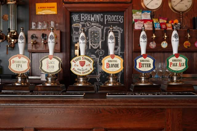
The latest designs build on the refreshed Three Swords branding introduced last year, which was based on an original Victorian Kirkstall Brewery showcard.
Following a positive response from customers and the trade, the brewery has now extended the look across its wider core range.
As well as Three Swords, the updated branding will feature on Dissolution IPA, Black Band Porter, Kirkstall Bitter, Kirkstall Pale and Kirkstall Blonde.
Chris Hall, Kirkstall Brewery's brand manager, said bringing the beers together under one identity had been a challenge.
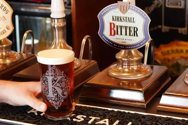
He said: "After updating the Three Swords branding last year, we realised it provided the framework for a diverse brand identity with one unifying story: heritage, consistently great beer and the Three Swords crest – all things that we are widely recognised for."
The Three Swords symbol was used by the Kirkstall Brewery Co between 1833 and 1983. Its origins are also linked to Kirkstall Abbey, where Cistercian monks brewed beer as far back as 1152.
Mr Hall added: "The Three Swords symbol precedes any other beer trademark and is the most important part of our story and our identity.
"Three Swords is also our hero cask brand, and it now leads an ensemble cast of beers that celebrate heritage, stand for quality, and belong together on bars across the nation."