As the Adidas Leeds United shirt hits the fans, Daniel Chapman misses an old friend
and live on Freeview channel 276
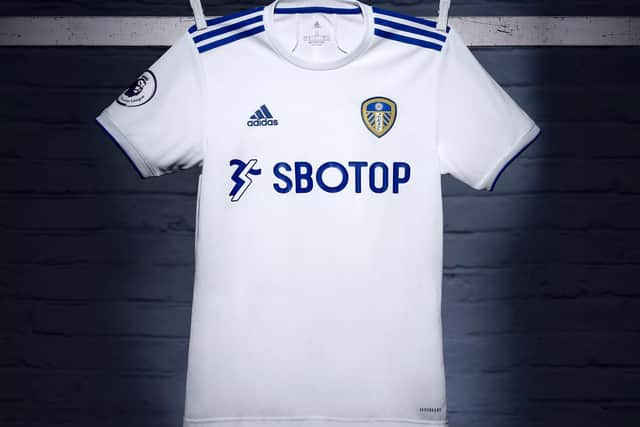
A short summer of slow motion came to several conclusions last week. Bayern Munich miscounted their Champions League trophies again, the fixture list sent Leeds to Liverpool for the opening day, and Adidas unveiled the Peacocks’ new home shirt.
The last of those was the biggest relief, because it meant people could get on with the very important business of hating it. Both too plain and too cluttered, with the wrong collar, sleeve stripes in the wrong place, no option for putting Ben White’s name on the back.
Advertisement
Hide AdAdvertisement
Hide AdTearing through the flimsy fabric with its teeth, the Dulux dog growled something about the wrong shade of white.
Like testing bouncy castles, designing Leeds United’s kit must be one of those jobs that sounds like a dream but is actually terrible.
The brief is simple, for a white shirt with bits of blue and yellow. But if you can’t telepathically collate the precise ratios of blue and yellow expected by thousands of individual fans and put that on the shirt, you might be better off ditching the pencils and going back to the bouncy castle factory to test their new ‘strewn-with-knives’ concept.
If United’s first chairman Hilton Crowther had his way, this whole question could be avoided. He spent much of the 1920s telling anyone who would listen that standardised kits were the way forward: home teams would wear blue and white stripes, as Leeds did already, and away teams would wear red and white stripes. And that would be that.
Advertisement
Hide AdAdvertisement
Hide AdHis replacement, EJ Clarke, felt differently. The city was still very doubtful about this round-ball business, and Clarke thought some civic pride might finally drag supporters away from their precious rugby.
Someone got their paints out and a new strip was proposed in 1927: dark blue shirts with collars and cuffs of primrose. Then someone got their thesaurus out and primrose was replaced by gold. The Yorkshire Evening Post led the enthusiastic response.
‘To thousands of people all over the country, Leeds means chiefly the association football team that plays at Elland Road,’ this paper wrote, not mentioning that to thousands of people in the city, Leeds meant the rugby team at Headingley, and the heathens in Holbeck could go jump in the river.
‘Anything, therefore,’ the column continued, ‘that is distinctive about the team and gives it character is surely all to the good.’ They would have loved grey and pink.
Advertisement
Hide AdAdvertisement
Hide AdA board meeting was held, and we can only imagine the fierceness of the debate. After what must have been many hours of intense arguments, the club announced a decision: the socks, once black, would from now on be blue.
As manager Dick Ray was sticking firmly to his policy of only signing youngsters instead of players for the first team, the joke went that it wasn’t only footballers United couldn’t afford, but football shirts.
The change was finally made a year later, and then another before Don Revie swept the palette in the 1960s, when Major Frank Buckley ordered a change from blue and old-gold halved shirts to old-gold with blue sleeves and collar.
Superstitions didn’t start with Revie, either: one fan wrote to The YEP that the old shirts had been unlucky. ‘Now we shall see them coming out looking like a football team,’ they said.
Advertisement
Hide AdAdvertisement
Hide AdIt’s the absence of old-gold that brings down Adidas’ first effort. Since the 1970s, blue has been the accent colour on United’s not-so-all-white shirts, but the best designs have included a hint of primrose as a final flourish. Look at the collar of our 1992 title winning shirt, or the 2001 Champions League number.
And it’s the suspected absence of yellow from the coming second and third kits that are likely to bring me back here in a few weeks when maroon shirts are being burned by angry fans on the Lowfields.
Angus Kinnear has pointed out that kits now change so fast that away shirts are almost transient, allowing for designs that are experimental and commercially led. But it’s not entirely true, or else the rumoured away kit of blue and green stripes wouldn’t be an homage to 1995, and echoes from the wholesale import of Lazio’s colours in 1999 wouldn’t still be felt in last season’s sky blue shirt. Football clubs hoard traditions, and have linked shirt colours to self-esteem since the sport’s earliest days. Shirts aren’t forgotten, as the retro section of United’s club shop demonstrates.
From the back of a stand, knowing Leeds are the team in white is all that really matters. But while stands are locked up and the new 4K friendly floodlights are illuminating Premier League close-ups, that absent golden gleam will be much missed.
By me, anyway, but I’ll learn to live with it. Until next season, when I can write a column about how there’s not enough blue.
Comment Guidelines
National World encourages reader discussion on our stories. User feedback, insights and back-and-forth exchanges add a rich layer of context to reporting. Please review our Community Guidelines before commenting.