Join Frankie Bridge and Made In Chelsea star Sophie Hermann on SS19 fashion trend Project Colour


To be honest, it sounds like a threat. For spring/summer 2019, the fashion colour palette is going indefatigably, unflinchingly bright and bold, bringing us a brilliant fruit bowl of luscious shades guaranteed to zing us all up and shake away any underlying lethargy (or that mind-aching feeling induced by Brexit).
I feel slightly weary just writing this, but actually, it’s not that bad. It’s quite thoughtful in some ways, throwing our way the sorts of colours – and colour combinations – that we might initially dismiss as a bit “yikes”, but which, on second or maybe third glance, start to look directional in a cheery “I refuse to give in” sort of way.
Advertisement
Hide AdAdvertisement
Hide Ad“Empowering” is the term I am searching for, as this is how global colour authority Pantone described SS19 fashion palette trends, adding in “confidence” and “spirit” for good measure.


Pantone says that for this season colour choices by international fashion houses are retailers are uplifting and joyful, packed with “playful expressionism” and taking fashion lovers down a “path of creative and unexpected combinations”. There’s more. Chosen hues for SS19 should be “vibrant without being overpowering” and they suggest a search for the authentic, the creative and the relatable.
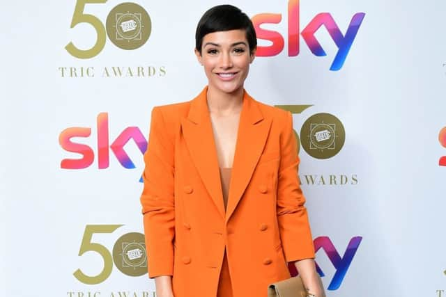
Sounds interesting, if slightly exhausting. Pantone released a list of 12 top shades, the boldest of which are Fiesta, an orange red that, Pantone says, “radiates energy, passion and excitement”; Living Coral is animated with a golden under-edge which softens it; Jester Red is a deep red, intense and graphic; and Turmeric is an “enlivening orange that infuses a hint of pungency” into the palette. I’m not sure I want to wear something pungent, but if that means intriguing and a little bit spicy then I’m all for it.
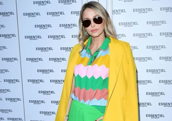
One unusual pairing we are seeing is yellow and green together – common enough in nature, not least among hosts of golden daffodils, but not often in fashion. Yet this season, from catwalk to high street, it’s everywhere, and clever designers seem to have been able to create vibrant combinations that show of both shades to their best advantage rather than looking as if they are having a dust-up with each other. At the recent launch party of Belgian fashion house Essentiel Antwerp, sunny yellow and luscious leaf green – either separate or together – dominated among guests, worn by model Jodie Kidd and Made in Chelsea resident Sophie Hermann, among others.
Advertisement
Hide AdAdvertisement
Hide AdSome commentators are seeing this rush to yellow, in particular, as a reaction to the dank and dreariness brought about by politics as designers instead choose positivity, a shade symbolising energy and optimism. Sunset yellow and burnt orange, it could be argued, perhaps introduce more elegiac notes, but these shades are still bold and beautiful – and eminently wearable where perhaps sunshine yellow might dazzle.


For the greens, there’s Pepper Stem and Terranium Moss from Pantone, rather earthy and forest-like tones (look for leather skirts and trousers, especially in a snake print) but fashion has zested up the green palette with mint and lime.
All the citrus tones work brilliantly with SS19’s neutrals of camel and beige and are ideal for giving a head-to-toe beige look a pop of colour to lift it.
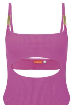
And then we come to the pinks, which Pantone has named Sweet Lilac, a pink-infused lavender that gives a quietly vibrant soft glow, and Pink Peacock, a richer, more theatrical fuchsia pink. Both are ideal for special occasion dressing and both are bringing a strong but delicate appeal to tailored looks, especially trouser suits and matching dresses and coats.
* There’s more Yorkshire fashion and beauty here